If you’ve used a computer or smartphone screen, you’ve likely heard the term “gamma value” or simply “gamma.” It might sound technical, but it’s actually closely related to our daily screen viewing experience. Whether you’re binge-watching shows, gaming, or working, gamma quietly affects your visual perception. Today, let’s dive into what gamma is, why it’s so important, and how to adjust it for different needs.
Why Do We Need Gamma?
Simply put, gamma is a “calibrator” for how your screen displays brightness and color. It determines how the screen translates an input signal (like the pixel data of an image) into the brightness you see. Screen brightness doesn’t change linearly—our eyes are more sensitive to changes in dark areas and less sensitive to changes in bright areas. Gamma is used to compensate for this difference.
For example, imagine looking at a photo with a gradient from pure black to pure white. Without gamma correction, dark areas might appear too black, losing detail, while bright areas could be overexposed, losing all sense of depth. Gamma acts like an intermediary, helping the screen distribute brightness in a way that’s more aligned with how our eyes perceive light, making the image look more natural.
How Gamma Affects Screen Brightness Performance
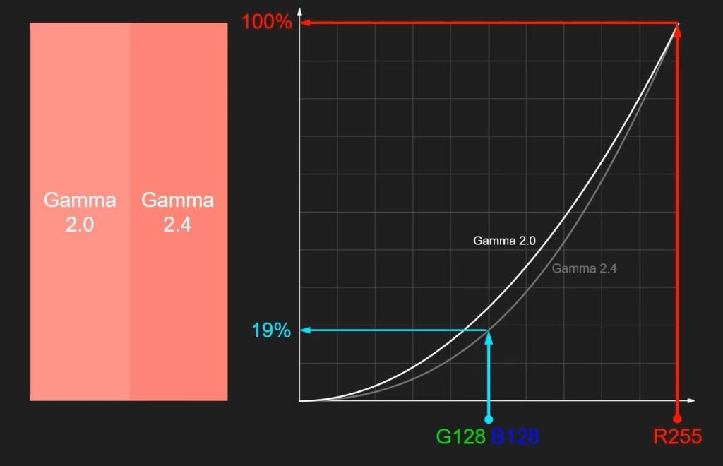
Gamma values typically range from 1.0 to 3.0, with 2.2 being a common standard. For instance, the sRGB color space specifies an encoding gamma of approximately 2.2, and Windows systems default to a display gamma of 2.2. Different gamma values directly alter the screen’s brightness characteristics:
- Low Gamma (e.g., 1.8): The overall image appears brighter, with richer detail in dark areas, but bright areas might look “washed out” or as if covered by a haze, lacking strong contrast. This setting can be useful in some design scenarios, like photo editing where you need to see details in shadows.
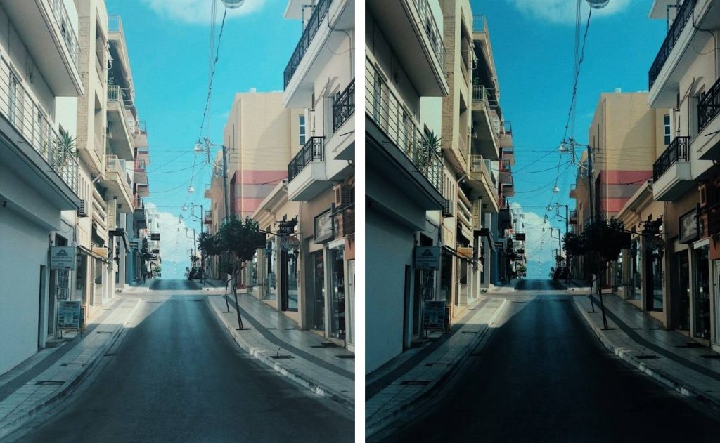
- High Gamma (e.g., 2.4 or 2.6): The image appears darker, with deeper shadows and more intense contrast in bright areas. This effect is popular in film post-production as it can give footage a more “cinematic feel.”
- Standard Value (e.g., 2.2): This is the default value for most displays and the recommended value for the sRGB standard. It strikes a balance between brightness and contrast, suitable for everyday use like web browsing and video watching.
An incorrect gamma value can make the screen look either too harsh or too dim, directly impacting your viewing experience. If the explanation of gamma still feels a bit unclear, try this online tool to adjust the gamma of a specific image for a more intuitive understanding.
The Relationship Between Color Accuracy and Gamma
Gamma affects not only brightness but is also closely linked to color accuracy. A screen’s color performance depends on the correct mapping of brightness and tones. If the gamma value deviates from the standard, colors will also “drift” or appear inaccurate.
For example, if gamma is too low, colors in dark areas will appear overly bright, potentially turning a deep blue into a light blue. If gamma is too high, colors in bright areas will be compressed, possibly making a vibrant red look dull. For designers or video editors, an inaccurate gamma can mean that the colors you see on screen are completely different from the final output, affecting the quality of your work.
Therefore, professional monitors are usually calibrated to a gamma of 2.2, or adjusted according to specific industry standards (like BT.1886 for the film and television industry), to ensure color consistency from screen to final output.
Blindly Pursuing High Gamma
Some people hear that a high gamma value can give an image more “depth” or “richness” and indiscriminately crank it up, say to 2.6 or even 3.0. But this isn’t always a good idea.
For example, if you set the gamma too high on your computer, over time you may get used to how the display looks with that setting. However, when you show something to others, they might say it looks strange.
When playing games, an excessively high gamma value can make it difficult to see enemies or items in dark areas. While watching movies, nighttime scenes may appear completely black. To see details better, you might increase the brightness of your monitor accordingly, but this can cause more eye strain because of the strong screen contrast and frequent switching between light and dark. Staring at the screen for long periods can damage cone cells in the eyes, potentially causing irreversible vision damage.
How to Set Gamma Based on Your Needs
Different usage scenarios have different gamma requirements. Here are some recommendations for common situations:
- Design/Photo Editing: Recommended gamma: 2.2, paired with the sRGB color gamut. This is the industry standard, and many drawing and color correction software default to color previews at this gamma, ensuring what you see is what you get (WYSIWYG). If you need to see details in shadows (e.g., when processing low-light photos), you can slightly lower it to 1.8, but ensure your monitor supports calibration.
- Film Post-Production: International video standards (like Rec.709) specify 2.4 as a reference gamma because it can simulate the display effect of a cinema, giving the image more depth. When creating, try to calibrate in a dimly lit environment to minimize interference from ambient light.
- Daily Entertainment and Gaming: A gamma of 2.2 provides a good balance of light and dark in most environments, offering rich detail without being overly dark. For competitive gaming, you can fine-tune based on room brightness and preference, perhaps lowering it slightly to 2.0 to enhance shadow detail and make it easier to spot hidden enemies. It’s advisable to use the in-game brightness calibration guide, aiming to make a gray card (or character skin tones) appear as a mid-gray on screen; the corresponding screen gamma will then be close to ideal.
- Eye Protection Mode or Low-Light Environments: When reading or using the screen at night, it’s recommended to slightly lower the gamma, reduce screen brightness, and use a warmer color temperature, according to your eye comfort. Gamma should generally remain between 2.0–2.2, so screen contrast isn’t overly exaggerated and light-to-dark transitions are smooth.
Methods for setting gamma vary by device.
- Windows has a built-in display calibration tool where you can adjust a slider to test gamma values.
- Mac users can use the Pro Display Calibrator or other software to meet their needs.
- Adjusting gamma on Android requires very low-level access, which is difficult to achieve on standard, unrooted Android systems. Most brightness/filter apps attempt to simulate this effect by overlaying a transparent or semi-transparent layer on the screen, but this isn’t true gamma adjustment.
- Professional monitors usually have built-in menus; consult the relevant settings directly. When calibrating, try to do so in a stable lighting environment, avoiding interference from sunlight or artificial lights.
Gamma might seem like a small detail, but it can significantly impact your screen experience. With the information above, you should now understand its role. By learning to adjust it according to your needs, you can make your screen display a more comfortable and accurate image. Whether for work or entertainment, a suitable gamma value can make both your eyes and your mood happier.